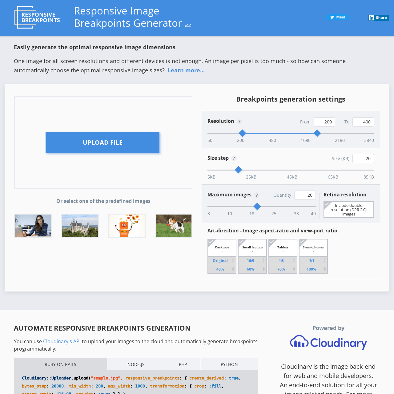
Responsive Image Breakpoints Generator
Easily generate the optimal responsive image dimensions. One image for all screen resolutions and different devices is not enough. An image per pixel is too much - so how can someone automatically choose the optimal responsive image sizes?

More from Testing
View all Testing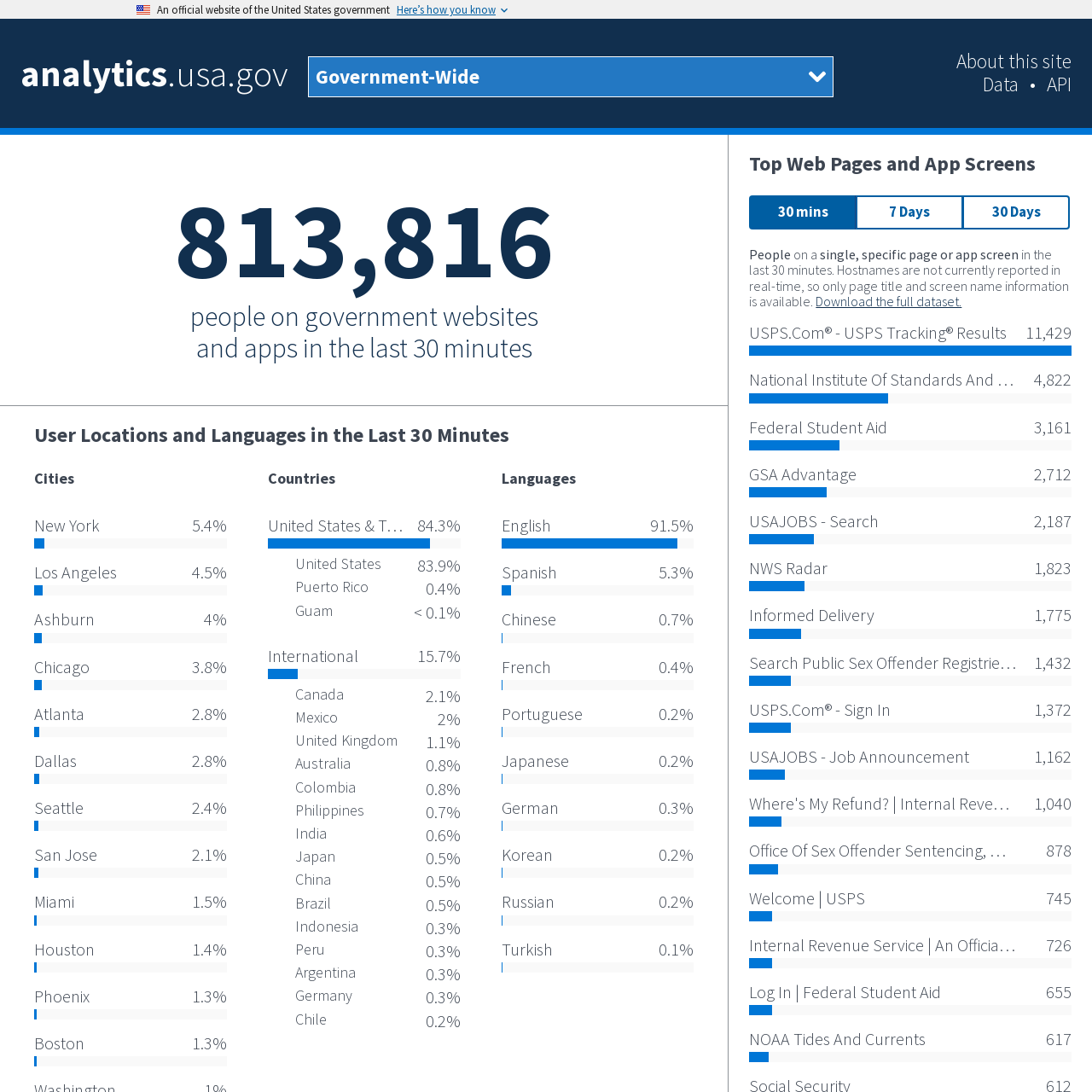
Analytics.usa.gov
These data provide a window into how people are interacting with the government online. The data come from a unified Google Analytics account for U.S. federal government agencies known as the Digital Analytics Program. This program helps government agencies understand how people find, access, and use government services online. The program does not track individuals and anonymizes the IP addresses of visitors.
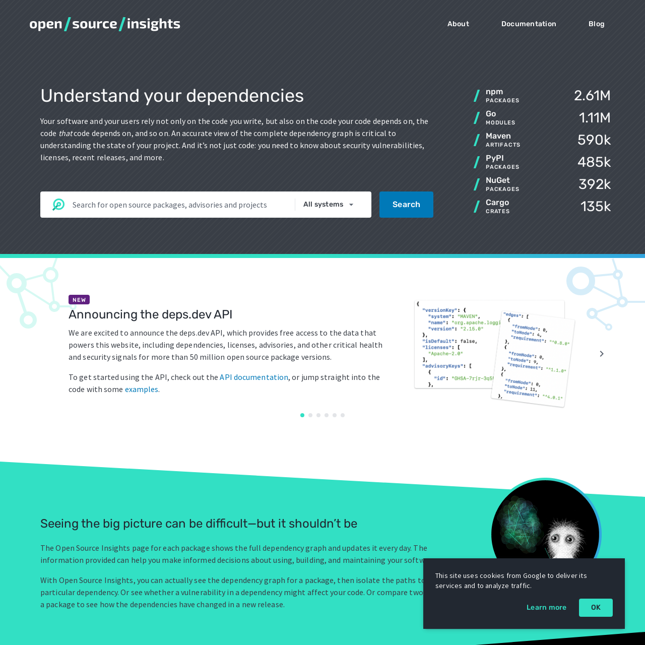
Open Source Insights
Your software and your users rely not only on the code you write, but also on the code your code depends on, the code that code depends on, and so on. An accurate view of the complete dependency graph is critical to understanding the state of your project. And it’s not just code: you need to know about security vulnerabilities, licenses, recent releases, and more.
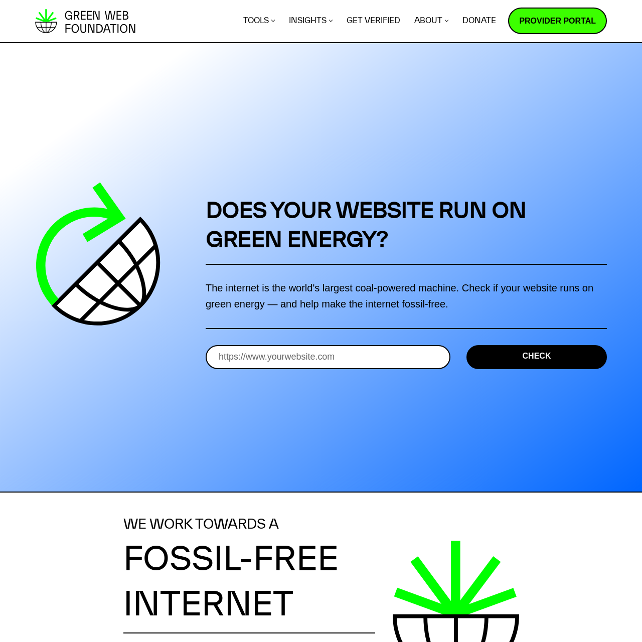
Green Web Foundation
The internet is the world's largest coal-powered machine. Check if your website runs on green energy — and help make the internet fossil-free.
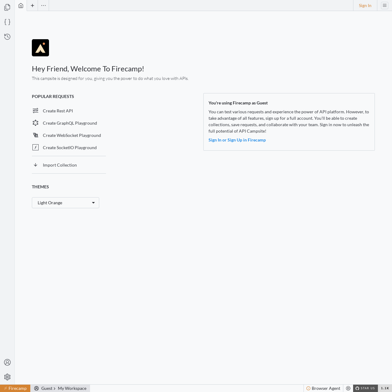
Firecamp
Firecamp is a DX first open source Alternative to Postman.

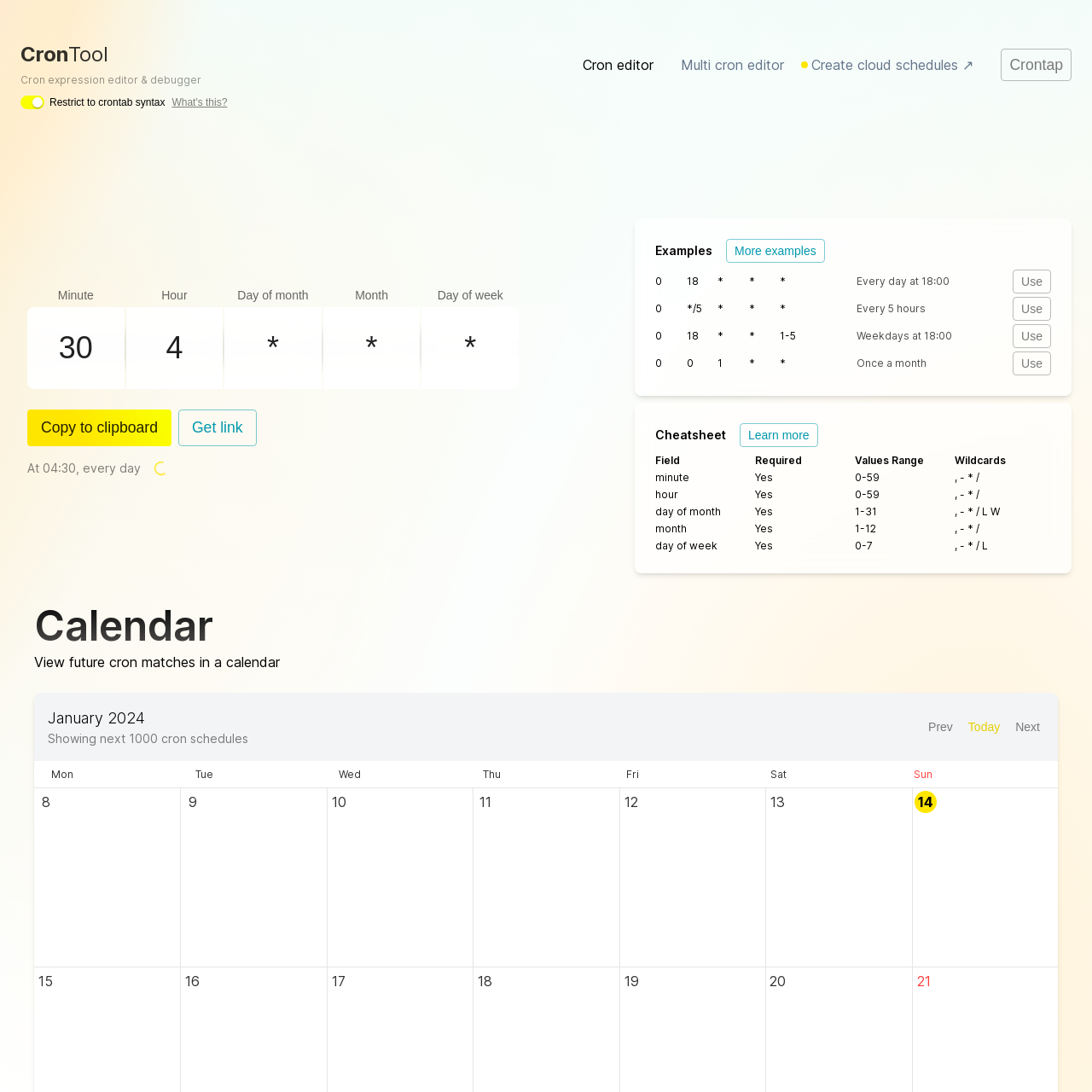
Cron Debugger
With CronTool you can edit, debug and view one or multiple crontab / cron expressions on a calendar - all online & free forever. The last cron expression editor you'll ever need. Share cron jobs with your team, write AWS & Vercel cron jobs and more.
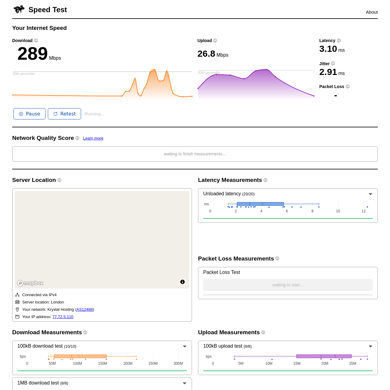
Cloudflare Internet Speed Test
Detailed internet speed test using Cloudflare servers. speed.cloudflare.com is a tool that allows you to measure the speed and consistency of your connection to the Internet. You can use it to verify that the speed your ISP promised you is the speed you are getting, compare different ISPs or test network connectivity in different parts of your house. The measurements run on the Cloudflare network, which spans data centers in over 300+ cities worldwide. This ensures you are testing against a server that is close to you, which means you are measuring only the speed of your ISP, with minimal networks in between that may impact your score.
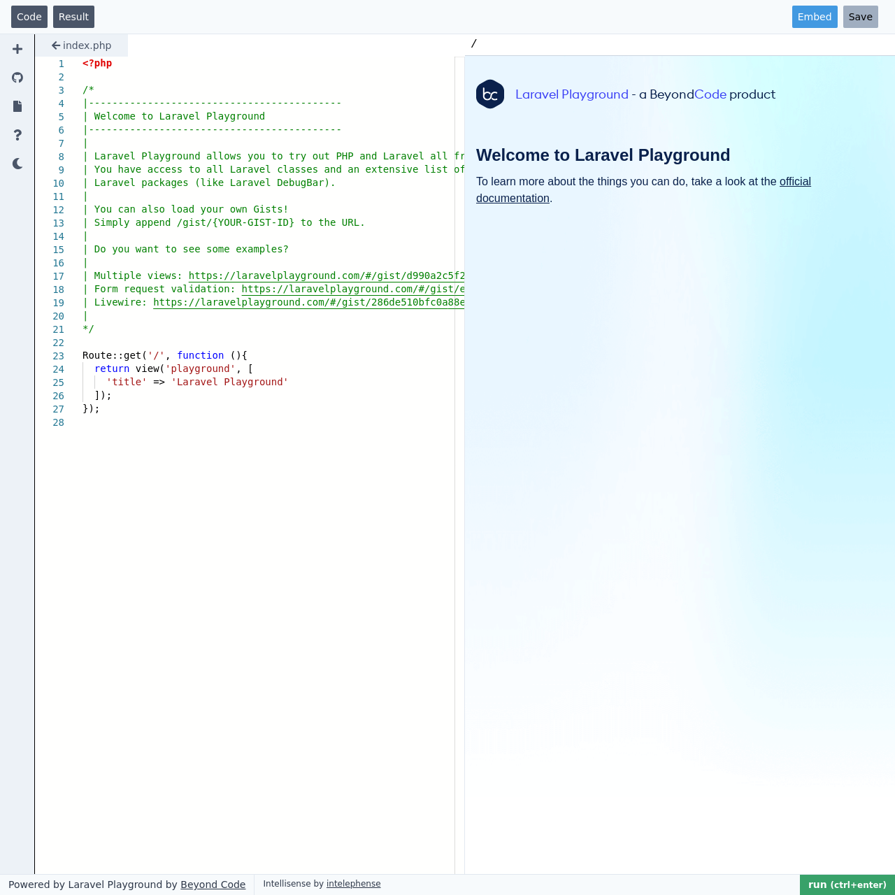
Laravel Playground
Laravel Playground allows you to try out PHP and Laravel all from your browser. You have access to all Laravel classes and an extensive list of included Laravel packages (like Laravel DebugBar).

HTTP Dump
Easily inspect incoming HTTP Requests. This free service gives you a unique URL to send requests to and inspect them.
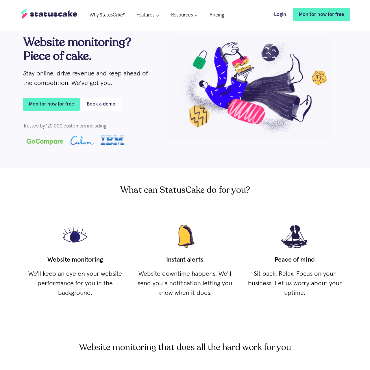
StatusCake
Website monitoring solution that drives revenue & keeps you online. Track your uptime, page speed, domain, server, & SSL certificates.

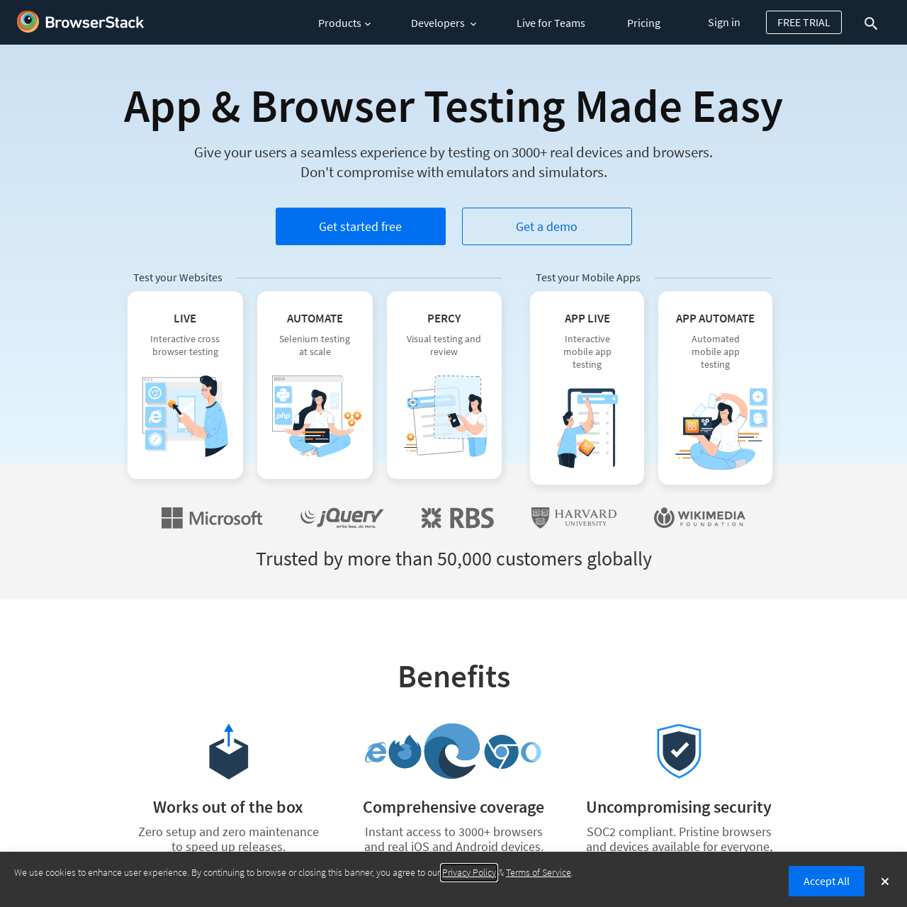
BrowserStack
Give your users a seamless experience by testing on 3000+ real devices and browsers.


UserTesting
Get paid to share your perspective on websites and experiences and make money online in your spare time
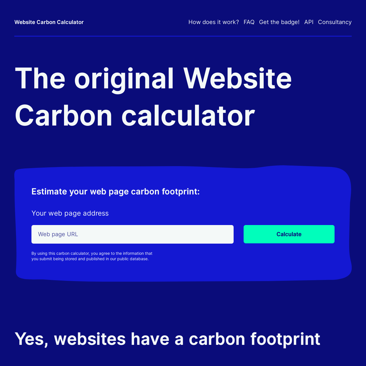
Website Carbon Calculator
Track your websites carbon footprint.
But wait, there's more! 🧰✨
Check out the sidebar menu (or tap the in the bottom right on mobiles) to search and browse by tag.